Contour Room Drawings
Critique Questions:
|
1. Did you use a fluid line? Explain how is this evident?
I tried my best to use a fluent line and make sure everything was at least as similar as I can make it. You need this because if you don't have fluent lines then your picture wont look put together or like it should. 2. Explain how your knowledge and creating practice studies with contour line contributed to the success of your piece. Entering this drawing class I honestly didn't know what contour drawing was or how it was done, but after learning everything about it, it was easier to understand that you follow the lines and the more you do it the better you get. 3. Describe the difference in your contour line drawing to an outline drawing. A contour line drawing is drawing every line or shape that you see and not picking up your pencil. But an outline drawing is just the outline without many details. 4. Explain how your interpretation of line is essential in capturing the look of the room. Your interpretation of line is essential in capturing the look of the room because you need to be able to see the different angles and draw them. You also need to be able to see all of the lines and how they are in real life and then mock them on paper. 5. What did you learn from completing this drawing? If you could recreate your piece what would you do differently to enhance the final outcome? This drawing helped me learn to be patient and work slow with drawings like this so you can get it right. If I could recreate this piece I would have picked a different part of the room that may have been easier to draw. Value Shading |
Final Drawing: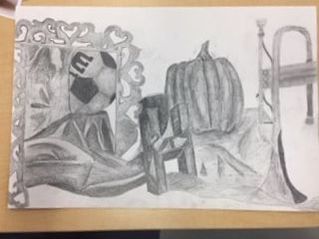
In Progress :Still Life The Still Life was really hard to do because you have to draw everything life size like and shade the different lighting. Also the all of the different fabrics and textures are also really hard too.
|
|
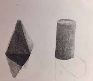
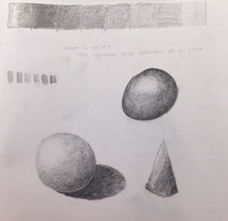
For the value shading I learned the differences and the different ways of shading. Its hard to shade when you're just learning how to properly use the drawing pencils and what pressure you need to put on them.
|
|
Paper Bag Drawing
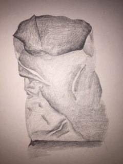
For this paper bag drawing you had to look at a crumpled paper bag and try to draw and shade everything you see. This was also kind of difficult at first because you don't know where to start and where to shade. After awhile I figured out kind of how to shade most of it to look resemble the crumpled bag. I think that this helped me for the future drawings that we will be doing, especially with all of the shading.
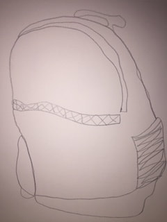
Shoe and Backpack Contour Drawing
|
The backpack and the shoe contour drawings were difficult. Because just like any other contour drawings you couldn't pick up your pen at any point. I found this really difficult because when you see that you mess up you cant fix it.
|
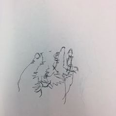
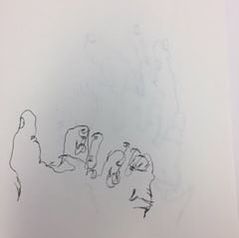
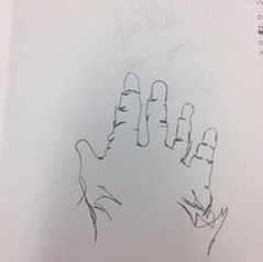
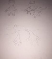
Contour Hands
These are my three blind contour hand drawings. These were extremely difficult to do because you couldn't see what you were doing and you had to fully focus on not picking your pen up off of your paper, while also focusing on your hand and all of the lines that were in it, instead of looking at the paper.
|
|
|
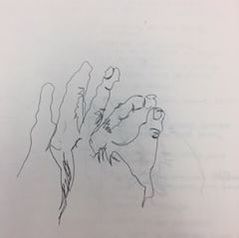
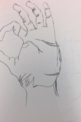
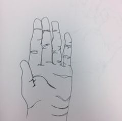
These were my three contour hand drawings, which I could see while drawing them but still couldn't pick my pen up. These were still really hard but turned out better than the blind contour. The hardest part about this one was that even though you could see what you were drawing you couldn't erase anything if you messed up or didn't like how it tuned out.
|
|
|
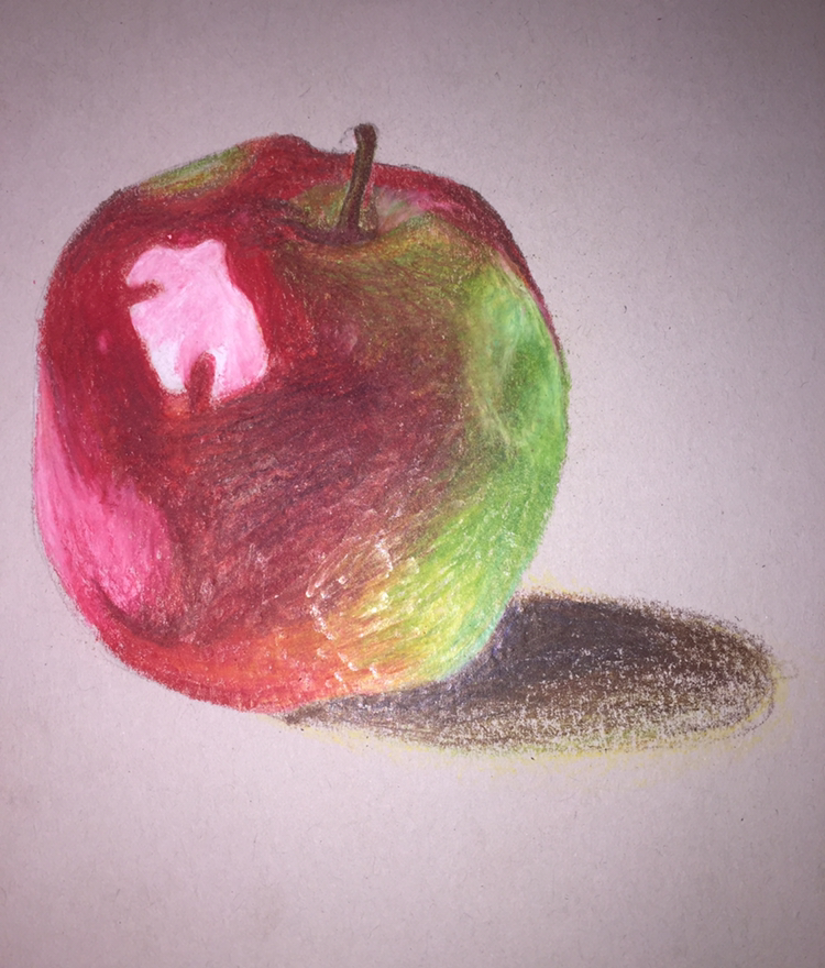
Prisma Color Fruit Drawing
|
For the Prisma colored pencil fruit drawings I learned alot about coloring with colored pencils and how to shade with color instead of regular graphite. It was hard learning how to properly use them and the different colored paper you use.
|
White Prisma Color Pencils on Black Paper
|
For this prisma colored pencil drawing you had to look at all of the shades. The really bright and the really dark, and you had to work with the black paper which helped a lot.
|
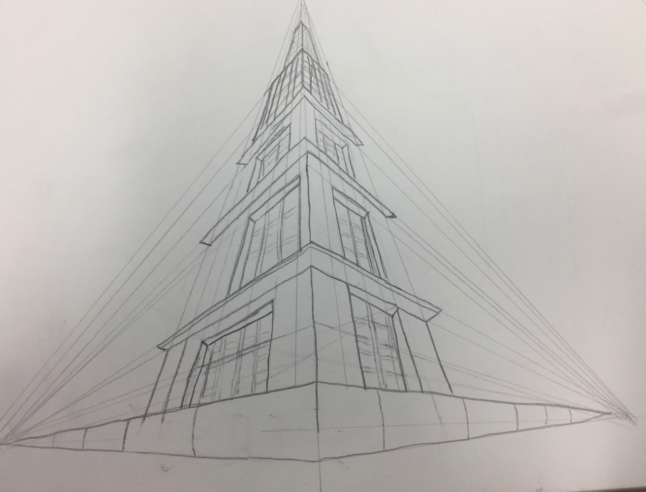
3 Perspective drawings
Still Life Compositional Sketches:
|
|
Look At The View Sketches: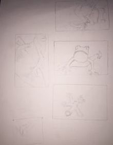
|
Look At The View Final Sketch: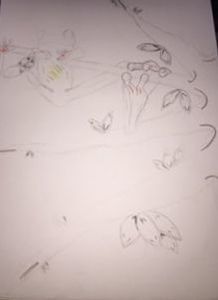
|
Look At The View Final
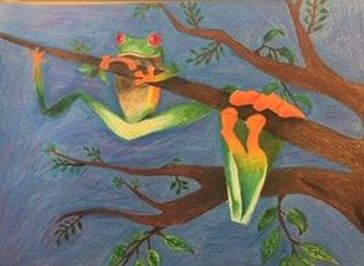
1. I created this point of view by taking a frog and zooming up closer than what you normally would see and angled it so half of his body is closer than the other side.
2. Its important to understand perspective and how to draw it because it helps you see everything from a different point of view and understand how to draw certain details.
3. The colored pencil exercises definitely helped understand how to use them correctly and how to shade and layer with them.
4. I used a lot of layers in my colored pencil drawing because it helps build up to how you want it. I also used different colored than what you would think you would need to darken a shade or lighten it.
5. I tried my best to show a background, fore ground and a middle ground. I made certain colors darker to show that it was further away, and i used certain colors to make it lighter to show that it was closer or that the sun was hitting a certain point.
6. I don't have a lot of experience using colored pencils especially prisma pencils, But when I did use them i wasn't sure how to correctly shade and make it look more professional.
7. I would have liked to be taught more about how to blend the colors, but I really feel like all of the exercises really helped with all of the shading and it ended up somewhat how I hoped.
Opacity Drawing Post:
Brainstorming ideas:
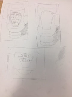
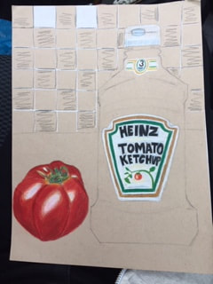
In progress photos:
|
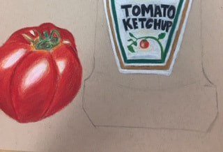
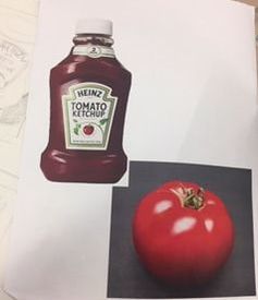
Comp sketches / Reference photos:
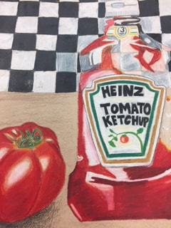
Final Opacity Drawing post:
|
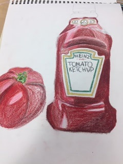
Critique Questions:
1. I think that this project was not my best but also not my worst. I could have done better on the background with making the lines straighter and making it look more in perspective.
2. The background choices that I chose, help tie everything together into one art piece because you can see the background through the ketchup bottle which makes it look more realistic.
3. I used a variety of different colors to create the shadows and different texture. You have to add different colors to make shadows darker or make something look more 2D. For example when I was coloring the ketchup bottle i used purple, blue and brown for some shadows so that the highlights were more enhanced.
4. I created contrast by slowly adding layer on top of layer.
5. I used textures, highlights and shadows to enhance my project by adding all of the highlights first so they would be more vibrant, and slowly kept adding layers to make the shadows.
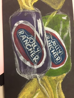
Candy Drawing |
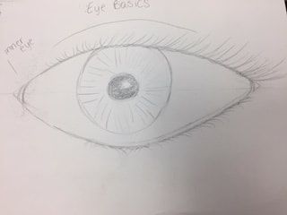
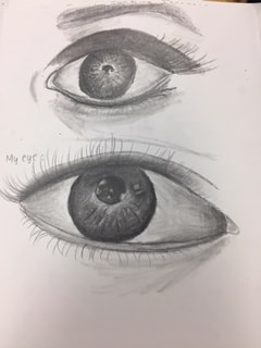
Eyes Drawing |
Pastel Fruit Drawing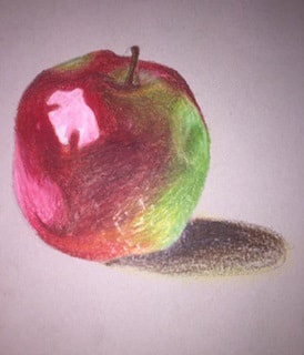
Nose Drawing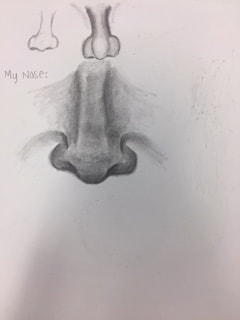
|
|
Lip Drawing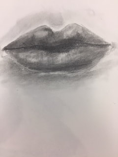
|
Facial Feature Placement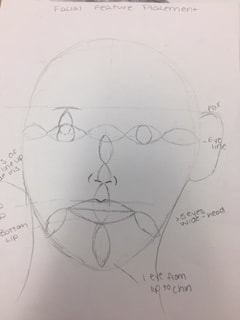
|
Portrait Final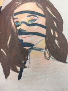
|
In progress portrait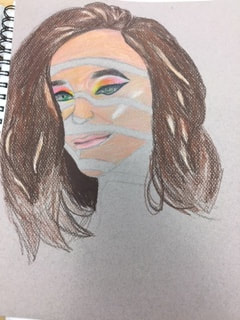
|
