4 Assessment Drawings
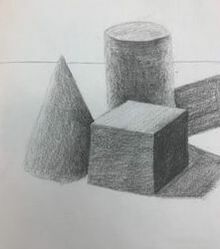
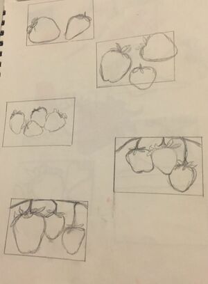
Pencil Shape Grouping
|
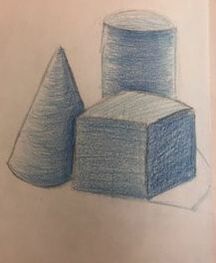
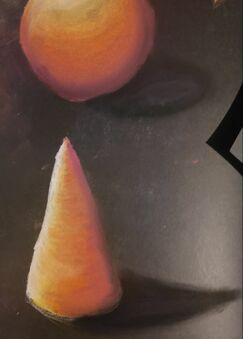
Color Pencil Shape Grouping
|
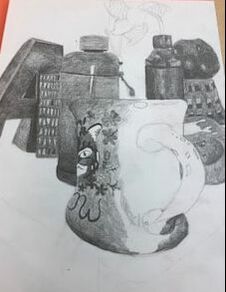
Final Still Life
Questions:
1. i Arranged my composition when i finished my composition sketches. I shaded the dark spots really dark and i just barley shaded the highlights to keep them light. I think that i definitely improved on this still life compared to last semesters.
2. I did use a wide range of values as you can see in the dark design on the mug and the shadow where the A is leaning against the tissue box to where the light hits the paint bottle to the handle on the mug.
3. My knowledge and creating practice studies with value contributed to my piece by doing this project last semester and figuring out what i did wrong then so i don't make the same mistakes and taking this slower and blend my pencil lines out better so everything looks smoother.
4. The blending and transitions that i used contributed to how much pressure that i put onto my pencil because if i wanted it to be darker i would put way more pressure than if i were to want to make it lighter. I also shade certain areas in small circular motions.
5.The interpretation of texture is essential in capturing the look of an object because if you get the texture right then it will look more 3D and believable.
6. I f i could recreate my piece i would probably take a lot more ime to sit down and make sure that all of the shading and proportions are right.
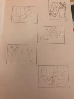
Still Life Compositional Sketches |
|
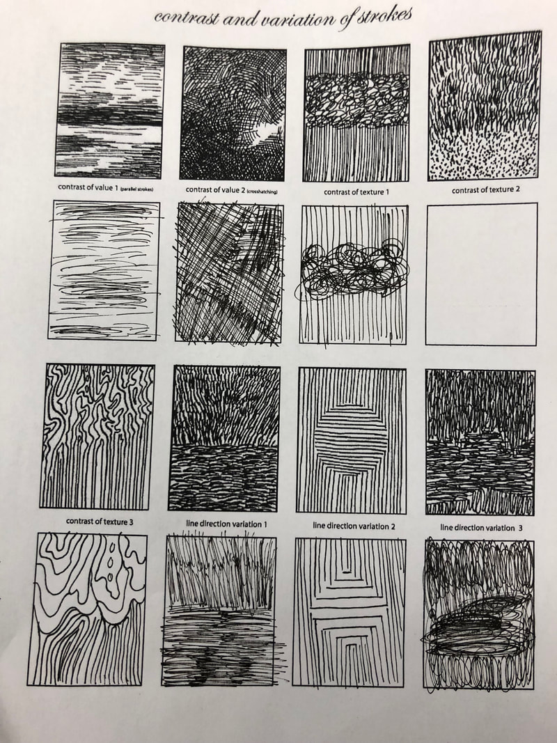
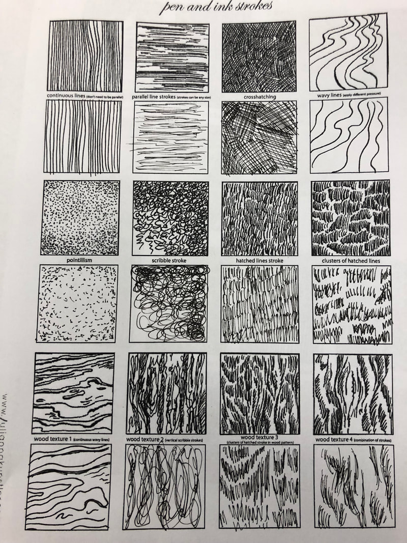
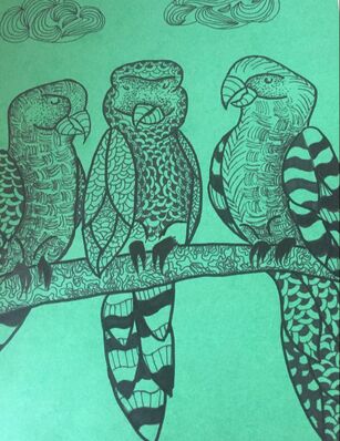
Pen And Ink
2 pen and ink video sketches
|
20 Project Ideas
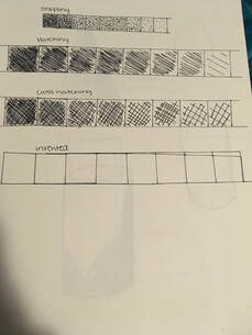
stippling boxes
|
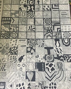
copy textures
|
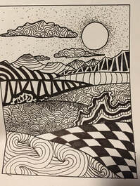
landscape
|
|
|
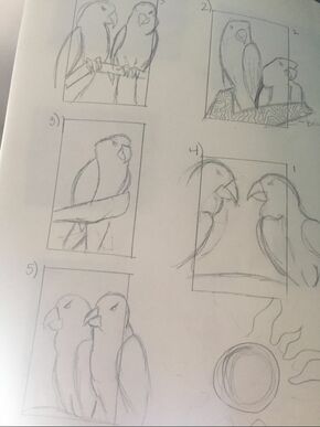
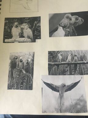
Compositional Sketches
final project
Questions:
1. I arranged my composition by thinking about what parts need to be darker and how much shading there should be.
2. Texture and shading are important so your project doesn't look flat to your paper but it will look more 3 dementional.
3. Value is important in this project because you are doing everything in ink so you cant really shade the same as if you were using a pencil. In this project we just had to do different designs, some with darker values than others so you can see what is closer and what is further back.
4. I think that technically the craftsmanship of this project was really cool and it taught me something that ive never done before.
5. creating value studies helped me get a better idea of how to make certain things look like they are popping out and helped me prepare to make different values and make it all blend together.
6. I think that it is very important to have learned all of the techniques taught in class before starting this project because we wouldnt have known how to make different values only using one color and some patterns. It also helped us plan out certain patterns that we liked and wanted to use in our final.
7. I think that everything that ive learned will guide me through future projects because weve learned how to properly shad and add value to certain things and how to properly blend different colors using different materials.
8. if I could redo my piece i would probably pick something different to draw because the birds were really hard to make their chest look round and get certain values on their wings.
Colored pencils
Prisma practice
|
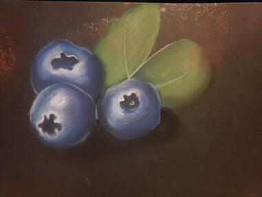
Prisma fruit final
|
Pastel pencil practice
|
Pastel final fruit
|
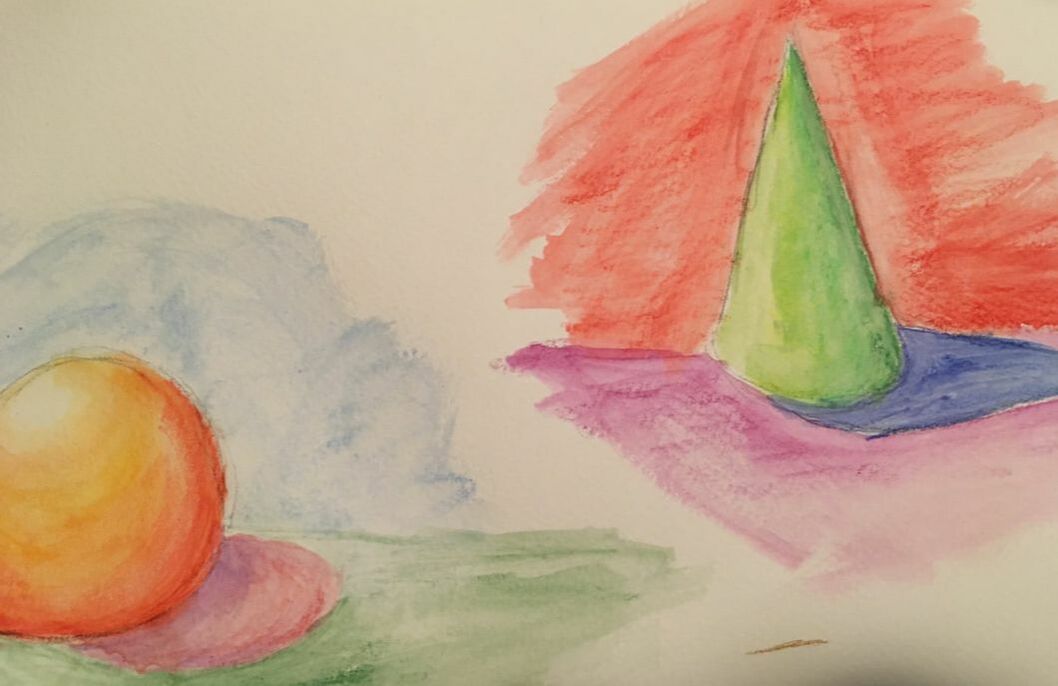
Watercolor practice
|
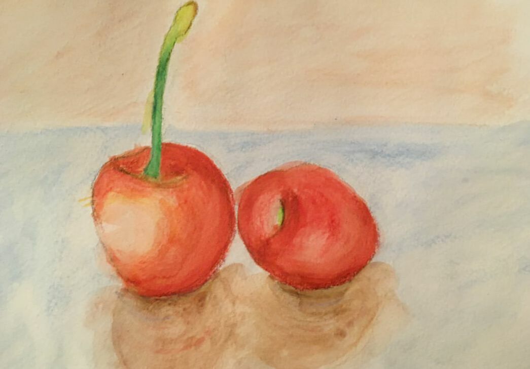
Watercolor final fruit
|
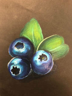
Colored Pencil Project
sketches
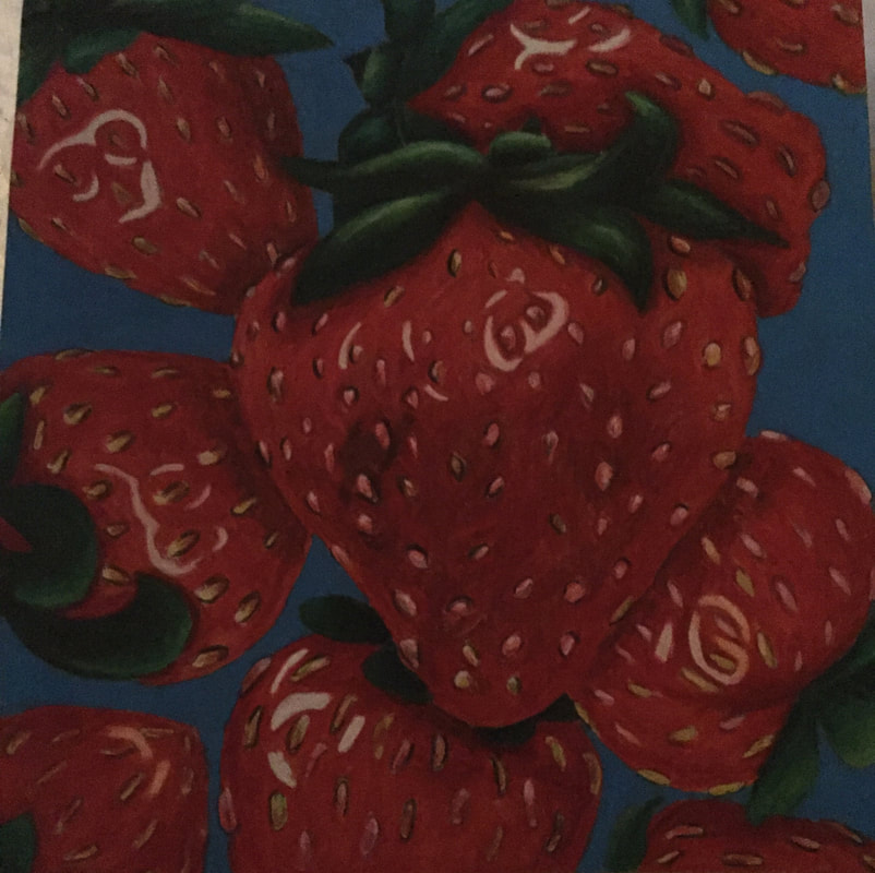
strawberry final
|
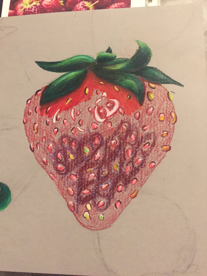
in progress
Questions:
1. I used value to make dimension in this piece by making shadows and lumps in certain areas to make it look more realistic as well as making certain areas lighter. I think this important so your artwork looks more realistic. 2. by using exaggerated color i feel like it made it look more real like instead of being dull. 3. In my opinion i really liked this project because it was challenging to do things so close up and some further away and with all of the details. 4. I believe i showed some depth by making a background and then strawberries that were underneath and the bigger strawberry with more detail. 5. My experience with colored pencils was pretty good i would have to say that it took me some time to fully get used to blending them and layering but i have to say that they are my favorite medium to work with. |
lino cut ink
Questions:
1. The overall craftsmanship of this project isnt my favoriate. the carving was probably the easiest part of the overall project, but the ink and printing part was the hardest because it would mess up if you put too much or too little ink or if you accidentally slid your paper.
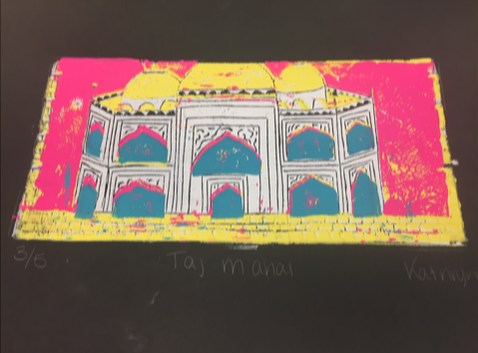
2. I tried to make texture by adding little marks while i was carving in certain areas or where i wanted extra detail i tried to make that. the taj mahal is originally white marble so i tried to keep that and add yellow to the top as a highlight from the sun.
3. If i could totally re-do this piece i would probably chose more of a different landscape than a building and choose my colors more wiseley.
1. The overall craftsmanship of this project isnt my favoriate. the carving was probably the easiest part of the overall project, but the ink and printing part was the hardest because it would mess up if you put too much or too little ink or if you accidentally slid your paper.
2. I tried to make texture by adding little marks while i was carving in certain areas or where i wanted extra detail i tried to make that. the taj mahal is originally white marble so i tried to keep that and add yellow to the top as a highlight from the sun.
3. If i could totally re-do this piece i would probably chose more of a different landscape than a building and choose my colors more wiseley.
Taj Mahal
The Taj Mahal is a mausoleum on the south bank of Yamuna river in the Indian city of Agra. The intricate art work on this building took 17 years to fully complete and the full value of this building is over $1 Million, the name Taj Mahal actually means "crown of palaces". It took around 20 years to finish this building. Mugahal Emperor Shah Jahah built the Taj Mahal as a tribute to his favorite wife . It also has 120 total rooms, a hall of mirrors and a savon bhadon pavilion, a fountain like structure that simulated the effect of rain.
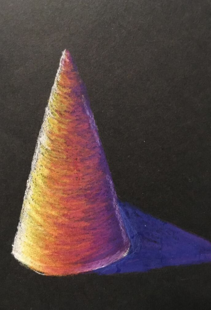
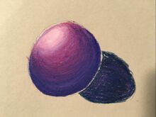
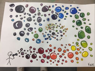
Color wheel
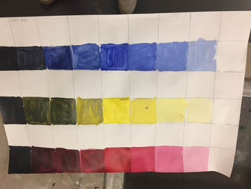
Value Chart
Clay Food Project
|
Questions:
1. In my opinion i feel like this project was well executed and i took the time to try to smooth certain areas out and add details where needed to be. 2. The most difficult part of this project was probably carvingin the indents on the bowl and sticking the whipped cream to the ice crea. 3. 4. I feel like my sculpture is interesting at all views because its not just flat on one side it has detail all around. 5. doing something 2D and doing a sculpture is very different because a sculpture is way more hands on and i feel takes a lot more time and patience. 6. i created textures in my sculpture by using the needle tool and my fingers. Imade the whipped cream by squishing the clay together and bunching it up. 7. 8.I feel like i would definitely make everything hollow before hand. |
